Kitchen Color Trends for 2026: What’s In and Why
In the world of high-performance kitchen design, color is never just "paint." It is an Aesthetic Load, a functional variable that changes how light reflects, how your space "feels" thermally, and how your kitchen’s infrastructure holds up over time.
In 2026, the era of the "Stark White" kitchen is over. We are moving toward Understated Confidence. For an apartment kitchen, where you often cannot change the "bones" easily, your color choices are your primary tool for reclaiming the space.
1. The 2026 "Accent" Palette: Natural Pigments
We are shunning synthetic neons in favor of "Natural Pigments." The goal is to make the kitchen feel grounded and stable.
| Color Name | The Vibe | Best Use |
|---|---|---|
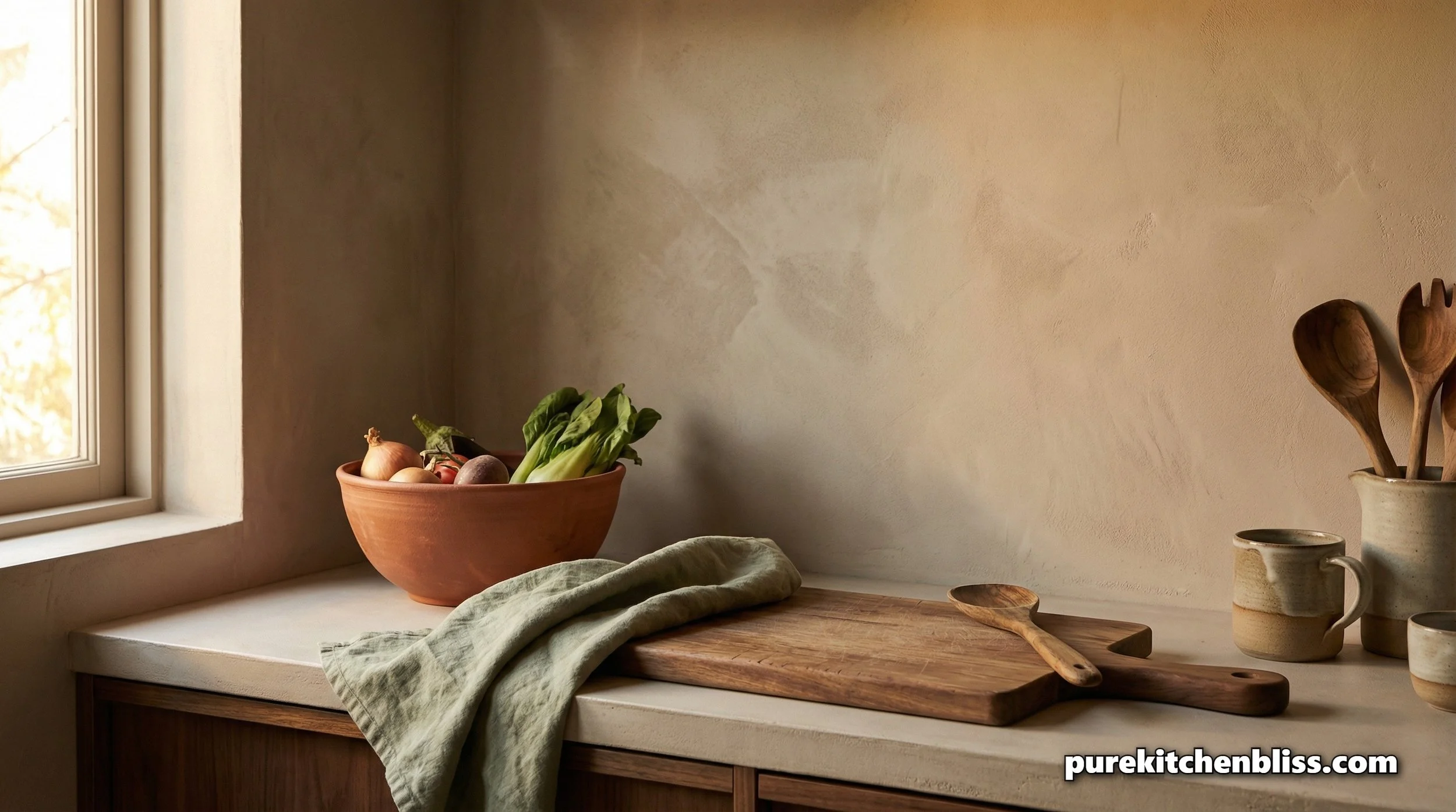
| Terracotta | Warm, earthy, and inviting. | Towels, bowls, or a small accent wall. |
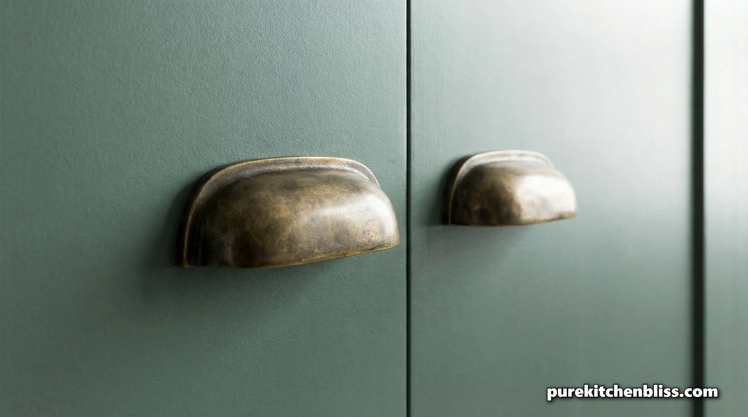
| Sage Green | Calming and natural. | Cabinet doors or open shelving. |
| Deep Teal | Rich and sophisticated. | Kitchen islands or lower cabinets. |
| Deep Burgundy | Moody and "old-world." | Vases, small appliances, or hardware. |
2. The Accent Philosophy: Engineering Functional Zones
In an apartment, a "pop" color is most effective when applied to a specific Functional Zone.
The Statement Island: A Deep Teal island acts as a visual anchor, allowing the rest of the kitchen to remain a neutral "Work Zone."
Hardware as Jewelry: Unlacquered brass or matte black hardware aren't just colors; they are finishes that interact with light. Paired with a Smoky Jade cabinet, it feels professional; paired with Terracotta, it feels historic.
3. Structural Layering: The Science of "New Neutrals"
Design in 2026 is about "Tone-on-Tone" layering.
The Protocol: If you choose a bold color like Deep Burgundy, use a "Mushroom Taupe" on the walls instead of stark white. This creates a soft, enveloping background.
Light Reflectance Value (LRV): Aim for an LRV between 40 and 60. This keeps the space bright enough for safety during your Sunday Night Countertop Reset but provides enough pigment to create that "Sanctuary" feel.
4. The Lighting-Color Interplay
Lighting is the engine of color.
The Specification: Warm Lighting (2700K-3000K) is mandatory for the 2026 palette. It brings out the richness in deep greens and burgundies. This is why we prioritized high-CRI lighting in your A Simple Guide to Choosing Under-Cabinet Lights.
5. The Psychology of Thermal Color
The "thermal feeling" of a room is influenced by pigment temperature.
Warm Pigments: Terracotta and Ochre increase perceived warmth. Excellent for inviting atmospheres, but can feel claustrophobic in small, high-sun, south-facing kitchens.
Cool Pigments: Teal and Sage provide a "cooling" effect. If your kitchen gets very hot during high-output cooking, these pigments expand the room visually.
6. Implementation Strategy: Color Without Commitment
The "Switch-Out" Strategy: Use small infrastructure, kettle, toaster, canisters, to introduce color. A matte, butter-yellow kettle provides that 2026 energy without requiring paint.
BUILDER TIP: MATTE VS. GLOSS
Gloss finishes are easier to wipe but highlight fingerprints. Matte finishes look sophisticated but can be difficult to clean unless they are "performance grade." Always select a "Satin" finish for high-traffic walls.
Conclusion: The Grounded Pop 2026 colors connect us to the landscape, earth, stone, and minerals. Whether it's an Olive Green cabinet or a Deep Teal bowl, let your color be an extension of your kitchen’s function.
Explore More in Your Sanctuary:
To clean your color accents: 5 Brilliant Uses for Castile Soap
To ensure your lighting is correct: A Simple Guide to Choosing Under-Cabinet Lights