Sunshine in the Kitchen: Why "Butter Tones" are Replacing Gray! ☀️
If you’ve walked into a kitchen showroom lately, you might have noticed a massive "vibe shift." For the last decade, we’ve been living in a world of "Millennial Gray"—everything was sleek, cold, and, honestly, a bit sterile. But it’s 2026, and we are officially craving warmth.
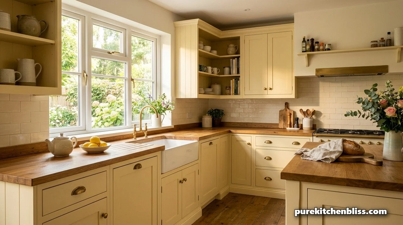
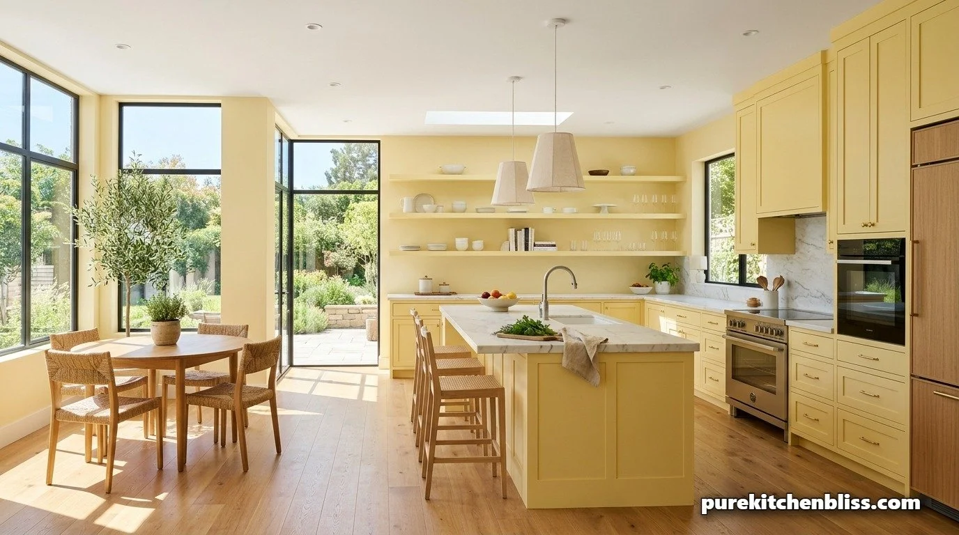
As a dad with four kids, I want my kitchen to feel like a happy place to start the day, not a science lab. That’s why I am absolutely obsessed with the new "Butter Yellow" trend. It’s not the bright, "school bus" yellow from the 70s; it’s a soft, sun-washed cream that makes the whole room feel like it’s glowing, even on a rainy Monday. Here is why this "sunshine in a can" is the ultimate choice for your kitchen sanctuary!
1. The "Happy Hormone" Factor 😊
There is actual science behind this! Yellow is known to increase serotonin levels.
The Bestie Tip: In a busy house of six, we need all the "happy vibes" we can get. Butter tones create an atmosphere that feels optimistic and bright.
The Move: If you’re not ready to paint all your cabinets, try it on your multipurpose island. It creates a cheerful focal point that anchors the room.
2. The Perfect Partner for "Earthy Neutrals" 🪵
One reason butter yellow is winning in 2026 is how well it plays with other materials.
The Combo: It looks incredible against light oak floors or your newly updated counters.
The Look: Unlike gray, which can look "dirty" next to wood grains, butter yellow enhances the natural warmth of the wood. It pulls the whole fabric of your design together.
3. Comparison: Cold Gray vs. Butter Yellow
| Design Element | The "Gray" Era | The "Butter" Era | Sanctuary Score |
|---|---|---|---|
| Morning Vibe | Cool / Serious | Warm / Cheerful | ⭐⭐⭐⭐⭐ |
| Light Reflection | Absorbs light (can feel dark) | Amplifies natural light | ⭐⭐⭐⭐⭐ |

4. It Hides the "Life" of a Large Family 👨👩👧👦
Let's talk "Dad logic." Stark white cabinets show every drop of spilled juice. Gray shows every fingerprint.
The Strategy: Butter yellow is surprisingly forgiving. The creamy undertones help mask those minor "life marks" that happen when four kids are running around.
The Result: You spend less time scrubbing with your hacked sponges and more time enjoying the space.
5. Accenting the Sunshine 🍋
To keep the look modern and not "country-kitsch," keep your accents sharp.
The Finishes: Pair butter tones with matte black or unlacquered brass hardware.
The Greenery: This color looks absolutely stunning next to the deep greens of your unkillable plants. When you bring "sunshine" into the heart of your home, your kitchen stops being a workspace and finally becomes a true sanctuary!
Next Up: Ready to pair this warmth with the rest of our 2026 trends? Check out our Bye-Bye All-White: Why "Earthy Neutrals" Are the New Sanctuary Look!